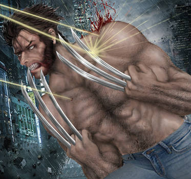
Jug you should already know by now that I really dig alot of your work. But I gotta say that this one I'm not feeling all that much. Color wise it's really working and strong all around especially around the bar where Logan, Kurt , and I'm guessing that must be Piotr. I think what throws me off a bit is their positions while sitting, nothing too bad about it but it just feels slightly off to me. Kind of feel like as if you should silhouette somewhere around their legs and even some of the bar patrons as well. Possibly highlight the overhead lights over the three as well to make us focus in on it more. I totally get you're trying to make a faithful recreation but tweaking it slightly will do no wrong. The second wide panel is pretty good but the background feels really dull. Would like to see some kind of activity even if it is silhouetted in or otherwise implied. And Piotr's position when talking to Logan looks a bit awkward. Same goes for Kurt. Beyond those issues I think this works fairly well in a close as possible recreation.
Hrm. You wouldn't happen to have a link to the original pages would you?
Anyway. Though I feel I am in no position to critique I will say, I think you have Wolverine's movement and posture done very well but everyone else seems kind of stiff in my opinion. Also the heads seem a little too squared away and angular. (Colossus' head creeps me the hell out)
One thing above all though is a problem everyone who wants to be a comic artist suffers from and thats lack of background. The bar scene is good but a little sparse but the rest of the shots are simply out in space. In a lot of todays comics I find this commonly because people I think don't take the time to try to get inanimate objects and perspective down when they'd rather be drawing musculature and womens... I know I have this problem in spades.
You can feel free to disregard this post if you wish, I just feel nosy and opinionated at times and I know my art suffers even worse than anyone's really. All in all though this is a really good set of panels in general.
--
"Believe those who seek the truth, doubt those who find it" - André Gide
Wolverine seems alot calmer than usual. Otherwise Great up and down.
--
Hopefully i can spark the mind of the person that will change the world. If not, I will change the world myself. Because I have enough love inside of me to change things.
The art, as always , is top notch. Peter's head does look strange in the second panel... maybe if you added some neck behind his jaw bone, it'd help fix that up. Other than that, the issues I have with this piece are more conceptual than anything.
First thing that comes to mind is Nightcrawler's total lack of a disguise. Yes, it's a dark bar, but his tail should NOT be up and flying around. The moment anyone sees that, the entire crowd would go into an anti-mutant panic. Nightcrawler knows this: hide the thing. Or at the very least, do NOT have it flying around at head level.
Also, Juggernaut's posture in the first panel looks off. It seems to be -correct-, but it just looks strange. Perhaps consider unbending the left leg and give him a bit more of a stride.
Second and third panel: Wolverine's implied motion bugs me. He has to put down the beer, reach ALL the way across, then grab his cigar and bring it all the way back, then turn to face Peter... which is a lot of action for something that happens between panels. I think that if you moved the ashtray closer to center, and put the beer in his other hand, that would rectify the situation... or maybe not have him holding the beer at all. Remember, in sequential story telling, what we DON'T show is just as important as what we do. Also, I'd place Nightcrawler behind Logan in that third panel, just to make it clear that he's turned to face Peter.
Throughout the piece, you've left no or little room for word balloons. The letterer would either have to cover your art (a travesty), or fill up the little negative space you DO have and make every panel feel confined and packed in. Perhaps in future pages, you should add word balloons, even if you don't fill them with words, just to see how it affects composition.
That's my take, anyway. Looking forward to seeing more!
I really liked the camera angles you used, and the way you worked the panels was interesting.
I'm going to go with what others have stated and agree that there should be some more background detail and/or moodier lighting. It doesn't have the smoky bar feel to me, especially with all the white in the bottom panel.
Oh! Also, I like all the folds and stuff on Logan's shirt. That stuff can be real tricky... at least for me!
Daily Literature Deviations is a group that is dedicated to bringing literature to the forefront of the deviantArt community. We attempt to accomplish this by daily featuring Literature artists from around the community that deserve the recognition, but are not getting it.
Each day we will feature 5 deviations from the Literature categories in a News Article. In order to support the artists that we feature, we ask that you the news article as well as check out the individual pieces. We understand that each day you may not be able to check out each and every one of the pieces, everyone has their own things going on. We just ask that you make an attempt to help support the growing Literature community.
I'm a lover of visual impacts. I like brilliant colors and shapes. And I decided to collect a whole stack of deviations that reflect that taste. These pieces showcased below deserve every bit of publicity you can give them. x)P
^Ikue has been a devious member of our community for almost 7 years and in this time he has proven to be nothing short of dedicated and devoted. Whilst volunteering his time over the last 22 months as a Gallery Moderator within the Community Relations Team, Chris has brought the Vector gallery and many vector artists directly into the spotlight. ^Ikue's commitment to the community is evident in everything he touches and you can always find him reaching out to others with an encouraging word. Chris is a natural leader with a vibrant and empathic personality, and is a role model for deviants everywhere. It's ev... Read More
Critiques
Previous PageNext PageThank you for your Critique
You are not logged in.